So the time has come for the final year at the University of Lincoln on the Animation course, and I'm preparing all of my ideas and designs, as much as I possibly can to pitch a film idea to my peers and tutors to hopefully get the chance to make it. The film's story stems not just from myself, but I asked fellow peer Harley Earl on board to help sculpt out a story and Direct with me a film that we both felt would be something special we could solely devote our time to this year. Also joining us is Mikey MacFadyen, a Lighting/Rendering specialist on the course who is happy to fulfil his specialism on our film. Alice Street will also work with us as our full time modeller & Zoe Cheale will also work as a Part Time modeller for this film. Bo Lee has also been participating in some subsidiary modelling.
As far as story goes, after drilling the pages of the book 'Idea's for the Animated Short' into our heads and watching numerous shorts to find out what's essential in a short and what is not, we've done as we're strongly advised...Keep it simple, but DON'T TAKE YOUR FOOT OFF OF THE ACCELERATOR.
''This feel-good short story involves two unconventional crooks; A Man, and a Monkey - as they undertake the bank heist of the century. Armed with an array of arsenal, and opposed by military grade oppositions, these two will try simply anything to wedge open the bank vault door (The Renowned 'Fool-Proof' Big-Assirius-Doorio 2000) and claim literally untold fortunes. In a world drenched in rich Neon signs versus a unique ageing colour palette, an unforgettable art style and a slapstick story we're hoping to present something quite so unconventional it's never been seen before all in this rich environment dislodged from time and space itself.''
For the chaotic sequence in the bank vault room, it's almost as though we have to try and choreograph it so it works in such a rhythm that is both intelligent, witty and outdoes itself per time. Here is a little plan I have put together, We have found that writing things down even before storyboarding can help us. This sequence laid out is quite simple, and it doesn't contain half as many props as we initially anticipated but I can see it as a doable task for such a short film. I personally can see it working, I see the potential in actually finishing it seen as we have to try and remain practical at all times during production (as our degree rides upon it, and it's a very serious situation). Harley and I did talk a lot about quick cuts and a faster pace building up but the only issue with this, is while yes It could add a whole new level of dynamism to the film and the pacing, and the way it all clicks together - That even I cannot deny, it all comes down to how all of the production will churn out in reality seen as time is not on our side. My main worry is how much extra time and work will need to be invested into modelling props and any extra animation (no matter how minimalist or extravagant it goes to compliment those props) for the amount of screen time they won't actually get, when we can really concentrate on a smaller segment of what we initially talked about - work it cleverly and in a way that works in a great rhythm.
On the good side, if it works and it is funny, we don’t begin to
over do it and outstay our welcome on the humour side.
If however the jokes and the rhythm we create don’t work, we won’t
have our fingers in a vice for too long a time - and we still have the chance to show off some great models and hopefully some tremendous animation as well that still has a fun feel to it. This is a fear based impulse
yes, but in the end it’s a practical decision. That’s essentially just the risk
that we take with physical comedy because everyone’s taste is so radically
different.
As our very first shot transitions in from
black to display a gorgeous and dynamically lit moon, it pans down through some
foggy city hue to reveal some dingy and slanted Bronx style buildings. On a
building off center to the right of the frame, lights flicker on in the
building, and the flickering of the lights then acts as a transition into the
next shot which will be a short 2D/After effects hybrid sequence that displays
the heist plan and what is hoped to be achieved in the film, setting into play
a chain of events that will hopefully unfold successfully.
In the next cut, close ups of City trash
cans and Fire Hydrants will make for a beautiful close up as they reveal
further up the street a 1959 Cadillac Sedan driving down the street until it
comes to a halt near the front of the camera. Without revealing the appearance
of any of the characters – the next cut reveals a shot of the car wheel, and to
emphasize the crooks leaving the vehicle, the car suspension will lift up and
be complimented with sounds of car doors shutting and footsteps. After this the
frame will be completely black in a new cut, which will then turn into the
crooks via. The use of lasers will cut their way into the Bank Lobby. As both
characters make their own cut out, one of those cut outs falls forwards to
reveal the silhouette of the character whilst the others cut out falls back –
crushing him.
In the next shot, we see an employee’s only
door in which is revealed to be at the other end of a grand lobby filled with
royal colors, grand endless pillars supporting an unseen roof and a moving
laser field – which unfolds as the monkey begins to almost dance through the
laser field, evading triggering any of them. When the monkey gets to the end,
he whips out a 50’s pistol and shoots the door (that will be unseen on frame,
but heavily emphasized)
And finally, we inter the bank vault room
where we intend to use a snap zoom to zoom in on the vault door as our main
point of interest. After this…
Dynamite is assembled on the bank vault
door, and the carnage commences.
1.
Man - Dynamite & Lever.
Dynamite doesn’t work so man hits it with hammer to try to get it to work, it
blows up. Hammer drops back down into scene and hits the man on the head – thus
knocking him out.
2.
Man – Holding a Pneumatic drill
at a 105 degree angle against the bank vault door – with it’s erratic vibrating
the handle is coming back and furiously hitting the man in the face. Knocking
him out again.
3.
Monkey - Black circular bombs
in each hand sparkling and ready to blow with Monkey giving cheesy grin. Acting
as a quick cut between this, the man shakes his hands radically dismissing the monkey’s
suggestion with a face of worry.
4.
Man – Utilizing a Chainsaw that
he cannot lift, the man accidentally saws a hole in the ground and falls
through it – plummeting to the ground below.
5.
In another conversational quick
cut, the Monkey then advertises the nuclear bomb in both arms above his head
with a zany, huge grin, acting erratically. Man dismisses this again, but in a
more tensed up expression than his last dismiss ion to the monkey.
6.
Monkey jumps in the air and
freezes throwing the Japanese blades of death, but as monkey lands, he
coincidentally falls down the hole made in the previous gag.
As the short draws to a close, a camera
displaying all of the carnage laid across the room– which will be all of the
weapons and a couple of Easter egg weapons, the hole in the ground to
essentially capture a bigger scope that they initially went through more
weapons than we showed - and lastly an untarnished Bank vault door (with the
sarcastic shiny glimmer) the man lies face down on the floor, the monkey
nowhere to be seen as the final act comes into play. Just as the bank vault
door begins to open slightly, through a mixture of sounds of a large vehicle
pulling up and whipping and wrapping of chains; complimented by a shot of the
glimmering bank vault door, the wall cracking around it - the vault is
literally ripped through the wall by another set of unseen criminals. As this
takes place, the man looks upon in horror and disbelief as the monkey lifts
it’s upper body out of the hole he previously fell down and joins the man in his
face pulling before cutting to black and the credits begin to roll.

And so, here is the start of the Pre-production/Visual development work.
CHARACTER DESIGN
First off with the basics, it's nice just to get back into some intensive drawing again and up the skills for the year ahead, so I present some samples of life drawing. The two below are 10 minute poses. A1 Paper. Grey Thick Marker and 0.5 Biro Black. 2013. Photographed, and touched up in Adobe Photoshop to enhance contrasting elements.
and some primary research of human beings interacting in a city environment, seen as my film will be set in a city, it was important for me to sit down in a city (In this instance, being Sheffield and Lincoln) and just draw people in their environment. Even though my film is set a night time, and everybody is asleep in this foggy and cold environment, it's still important to sit there and get a feel for it yourself.
These are pages from my A4 Landscape sketchbook and iv'e just touched up the drawings in Photoshop to enhance contrast between black and white. Originally drawn with a Fine 0.3 Biro. Dog and Dog Walker - silhouette posed out quickly with Thick Grey Marker. Sketchbook. 2013.
A piece of realism portraiture that I have been slowly amending throughout my period in Pre-production on this film...every little helps...
Now we have the basic's covered, we can move on to the cartoon-y stuff...
Monkey body samples...
Monkey hand gestures...
Exploration of BIG, Bulky male heads for the man.
The first one on the left is partially based as a caricature of Robert DiNero, but I like the way the
drawing turned out, as it retains a bulky but narrower top, and the head shape widens as it reaches down to the shoulders to hold the weight of the above. The second one ran away with itself a little bit, starting out again with a narrower head at the top, but the chin spiralled out of control a little bit, and it distracts more than I'd certainly like it to.
This would be my Final Face design. I did just start drawing it and I was excited to se where it went from there, but it worked out quite well, but what I may do is try and add a more angular look to this design when I try some more development.
Poses & Shape development to be handed to Harley for him
to produce us a Character turnaround. I did try drawing another head just
to see how things could work for the character if we at least tried a change, but from our final design below which everyone in the team loves, we
decided it would be our Man.
Refined body design with Refined head design included.
Elaborating on how i'd like the final design for the man to be, with a more angular shaped head, and using the body developed from the poses above - so that there's a delicious variety of shapes. There's an element of fun there with the roundness to the body and the almost sand bag type arms as well that makes him visually appealing. The term among character designers 'Straights VS Curves' was put into practice heavily in this design to achieve the best result's I could.
These are my final development drawings for the characters taking in all from the development drawings that I have done. Harley whom I am working with will now go and take the development sketches that I have done, and this finalised design below and create a turn-around sheet. This turn-around sheet will again be supervised to retain the shapes that we have captured in the drawings above and below, but he will make some alterations to them to make them more feasible and functional to work as a fully revolved and functioning character in 3D Space.
What's a crook without a criminal record?
A selection of automobile drawings with a range in era's;
from the 1920's type gangsters to the 1950's (and some others that
present a real unique look)
With this more unconventional shape for a car, i'm working
on something that I thought would be a fun idea, of there
being a car powered by nuclear energy, trying to deter the worlds
leaders from using nuclear energy for bombs and war - and
turning it to an everyday/rather mundane use for the general
public. So below we have the funky shaped design i'm coming
up with.
And going back in time a little bit...
The Environment. So we can explore more avenues and include more artistically,
the city itself will be a place dislodged from time and space, featuring some
elements that are 1920's and others that are very 1950's, again we're
not set out on creating a real world environment, we know
we want this to be a slapstick cartoon, with a style. Below, the Building
Silhouette's, these could eventually be used as modelling blue-prints
when building them in Maya.
Building inspiration stems from 'The Bronx' setting in New York state area. These
old, 40's esque buildings that have aged and weathered out and away but still
stand the test of time and function for citizen's.
So rather than have these, really tall towering buildings that just say too much
I think it would create a more atmospheric tone if we represented these old and worn
buildings in a tone that matches the setup of our movie, with the less glamorous look
that we wish to achieve for the exterior. After all it is almost ominous what we want, so
we don't very well want to represent that mood with, big fancy buildings that spring from the
best of what a city such as New York has to offer, ranging from it's Art-Deco style to the style of buildings that began to develop the skyline in the 50's. We want it to be quite run down. The film Goodfellas achieves it perfectly.
What I love most about these older architectural buildings is
for the moments, that the audience will spend outside, the
buildings help retain so much more character, weathered and
splashed ast neon signs. The way the buildings slant and
almost architecturally unstable helps solidify the artistic st
I've tried some Pre-visualisation for our establishing shot based upon the drawing above. I have personally modelled these buildings literally referencing the angular style from the drawings in the visual development above; with simplified geometry and set a camera up to pan down into the buildings. This shot will be the first ominous establishing shot, and it will open with a moon, and then pan down - complimented with a dynamic sky, and the buildings will appear, and from that, on the main window on the third building (from the left - which is just about distinguishable in the Pre-visualisation) the light will come on, and this will open into the next shot, which shows the audience some 'Tom & Jerry-esque Blueprints' of the Heist plan. From this, our criminals will arrive at the bank. This shot is now literally ready for me to apply a texture to on the buildings & for Mikey to light. Iv'e asked if we can retain the silhouette-ness of the buildings, only lighting them from the back to distinguish their shapes, and from the above to give the rooftops dimensionality when the camera pans down. Mikey will receive this shot to play around with in respects to lighting and shading before his final work begins. As we're integrating a moon into the above shot, Harley sketched out a Moon that we both instantly thought would fit very well with the exaggerated world we are trying to build. Here is Harley's sketch:

And here we have digitalised it as a vector, so we can't possibly pixelate it! As it is a PSD file, we can easily remove the background which will make for better compositing in the After Effects stage.

Getting to know how some colours could work together, to
really capture a unique feel.
After seeing how Zoe modelled out Fire Hydrant, Harley and I thought it
would be cool to flaunt it using a close up, and the crookes car pulling up next to
the bank in frame with it, perhaps using a focus pull between the two
objects. Based upon Harleys description, I threw this blocky colour script
together to just grasp a small sense of the lighting/mood and composition
of the shot.
These colour tests are just mock ups where I am playing
around with lighting and colour palette's to preference. Harley is quite
interested in the Purple hues, so the painting below is to really test that out,
and then tweaked it in Lab colour/Curves settings in Photoshop to achieve a
different visual look, with some more red versus blue hues - which also
looks visually effective.
and a close up area of two colours that I believe (only from personal preference)
work really well together.
Playing around with Colour some more, including in Props! (Below)
Neon Signs! representing consumerism and the pleasures
in life, built on top of a rugged city landscape. I did enjoy
playing around with these, as it gives us more freedom
to artistically explore our exterior environment and give it
some jazz. The colours as well, will really stand boldly out
against any colour palette we splash in with them.
Alice's amazing models directly referenced from the drawings!
Every Gangster has one of these!
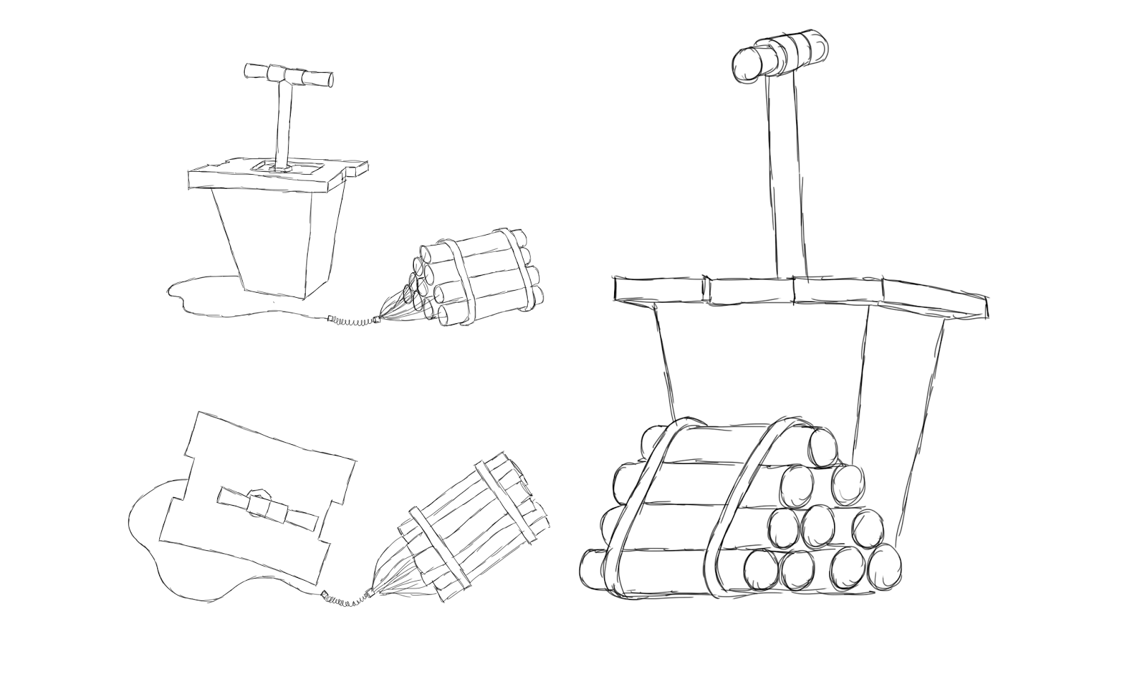
A selection of arsenal that might crop up!
A test to see if we can replicate the style in Maya, modelled by Zoe Cheale, which
has proved to be successful.
The Problem...
How the vault door looks at a 45 degrees opening angle,
and a 90 degrees opening angle. Must remain BIG, opposing,
the centre of the room, dominating above the characters, showing
them who's boss, without even moving. Has to represent 'The Stakes'
of the movie.
A test to see if we can replicate the style in Maya, modelled by Zoe Cheale, which
has proved to be successful.
Room Plan for the Vault Door room.
What's a heist movie if it doesn't have a corridor full of alarmed lasers?
For this test to see how the dynamic look could be achieved - I created a singular piece of cylinder geometry and applied a Lambert texture (Not a Phong or a Blinn because I do not want ANY specularity) and then without altering the incandescence, changed the colour to red, and by clicking the checkered box next to Transparency in the Attributes editor and I applied a Fractal from the selection of options that appears that gives the Lambert an ever so slightly transparent look up close has many different shapes on the surface, like a real laser and then I scrolled down the attributes to the Special Effects and turned up the Glow up to 0.455. Below is the finished result, and with the cylinder (with the texture applied) duplicated and all tilted at different angles to one another - we really get this dynamic look, where they all meet in the middle due to the framing, they all highlight and create this intricate shape that is a visual by itself, that i'm really excited to use in this film to raise the stakes of the heist!
Floorplan
A (short-time) finished render of the lasers with the above described shader.
Colour Tests
And a Pre-visualisation of what the finished scene may look like in Maya when the corridor has
been modelled and lit. I have lit it more promptly than we currently have planned just so we can see where the camera moves down the corridor, and because we are using a really low camera angle, we really get these dynamic shape swings in the lasers as our camera seamlessly flies in between them, that just adds another dynamic to the framing of the shot.
Meanwhile, after standing at a halt with creative decisions on how having separate rooms can really serve the story and allow that to shine through in the best way possible, whilst flowing smoothly and in a linear, short and snappy fashion, we figured that we may as well just combine all of our sets into one giant room to avoid any further confusion about getting our characters from one room into the next. This idea was graciously given in passing by the Talented Will Wivell, so Thanks Will for that, but with this in mind, below is the final floor plan for the interior set.
How the Vault container will look (Above)
and the complete interior floor plan/including camera placements (Below)
For the Bank lobby interior, I sketched up some windows that could work!
I have expanded upon this further by incorporating some uniformed pillows
that I have modelled in Maya and then done a quick render of those, and inserted
them between my window designs to just get a little grasp on what we might
want to achieve. To compliment the arch window tops we would like to have
arched rooftops, than span across the width of the room. Maybe we might
want to have taller pillows to really emphasise the grand-eur of the lobby, but
it's a start on what we can play around with.
How these windows may be used for the exterior of the bank...
I also painted as a reference perhaps for Mikey of what the bank lobby
floor may look like. Between the group we have settled on a marble texture,
but it may help Mikey further down the line to have more reference to how
something might look, after all what ever we can artistically do to help him
will result in a massive pay off for the work.
PROPS!
It's obvious from the visuals that this bin strays away from the design I have drawn,
however after consulting our modeller Alice, we spoke about perhaps tying it
in, with the fire hydrant below. After Zoe expertly modelled the fire hydrant, I and the others in the crew instantly fell in love with how respectful it is to the drawing - and in turn
this excited us to try and replicate this where we can, so we strived to do that with the bin too! Alice has done an absolutely tremendous job in making this bin her own after facing a few difficulties trying to replicate model a bin from my design, and so we're all very happy with the results we're getting stylistically. And it's great to see the whole crew excited at how we can do these things.
A test to see if we can replicate the style in Maya, modelled by Zoe Cheale, which
has proved to be successful.
Prop size in conjunction with one another
Emphasising on the above, some billboard designs...
If we go for that 1950's vibe, it might be important to
reference the paranoia of nuclear war; to just give
emphasis on the environment we're creating, that it's
a real, living breathing place filled with extraordinary
characters and locations that do come alive when the morning
comes.
Advertising a movie... The Shock/Horror type of thing!
What might a city look like out of focus? or in Shallow depth of
field when a characters stood in the foreground and we want him to
be the centre of attention in frame? hopefully we can get it to look like this.
The out of focus, is just so we know, when we make our CGI camera out of focus, because there's so many assets to play around with, we want to design it, to get a specific look, because you can get circles, squares, hexagons, when out of focus, depending what type of film camera you use, so it's more reference for us really, because we'll need to use focal lengths to visually help the story through, so other things don't distract the viewer.
Alice's finished chainsaw modelled in Maya.
More Props...
As for a car that we actually decided to go with, in order to get a true 1950's vibe to the film, and in homage to Harley on our team, we have decided to include a 1959 Cadillac Sedan in the film. The homage to Harley is that the fins on the back of the car were invented by an engineer with the same name - Harley Earl, so that's a very nice little touch there, but below are some reference images that have been given to Zoe for her model:
and an actual Blue Print reference that Zoe can import straight into Maya.
Referring back to Richard Estes paintings for some shader inspiration for the car's glossy showroom finish...
We plan to add MIA Maya shaders to the car to not only help flaunt a show room finish,
but it also means we may be able to evade UV mapping this set piece.
Brick Wall (All things considered...)
Another Prop that was worth sketching up!
Close Up of what our Blue-Prints may look like. We worked hard to try
and create a background grid system that didn't take itself too seriously,
but also was very respectful to what a heist-plan blue print might look like,
so the balance is quite interesting to play around with, and we look forward to the
challenge of bringing that to the screen!
MORE! Exterior Props (Again worth sketching up!)
Some extra scenery...
In the final panels below, Harley and I have come up with this idea of instead of
our crookes entering the bank through the door, they will instead cut their shapes
out of the door (a silly prospect really) via. lasers and barge their way through.
Below is simply a piece of concept art of what we want to achieve with this.
For the point of the path to be emphasised with a flickering flare. However this idea was later abandoned.
Thumbnails of a revisited laser room sequence where the monkey is thrown at the door and breaks through, and skids against the floor just in front of the lasers.