Richard Estes
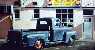
We have a car in our film, and nobody paints cars quite like the above.
The cars in this era were very glossed, very shiny and almost had to
live up to something, that a car was a thing of beauty, a piece of art. They reflected
everything, literally everything around them, from the body paint, to the shiny metal
bumpers, they soaked in every colour, every light patch, every dark patch and visually
it produces amazing results.
The yellow's and warmer colours in these Paintings are very much grittier and almost browned out; in contrast to those
that would have been painted in a countryside painting. It's as though Estes had literally
no intention of stylising what he perceived of the city. Just replicating it and guiding his
audiences into warped perspectives and the way his mind individually perceived the
city around him.
The reflectivity that the double doors produce here, and the idea behind the mind
bending visual that we are still treat to an impression, of what is behind where
the audience is looking, the street behind what would perceive as ourselves, literally
throws us right into the atmosphere of which Estes intentionally creates.
Ralph Goings
Goings paintings have been deemed 'deliberately objective' but for me, there's certainly a more film feel to these, almost like we're waiting to cut to another shot for something to happen. They have been specially com positioned and assembled to feel like that.
I love how Goings is visually perceptive of the depth of field in this painting alone, as though he is capturing what A camera would, but also heightening the colours and the saturation in the palette, to capture what a camera may fail to.
This definitely feels like a shot from a film...
The beginning of Pop Art...
Richard Hamilton's 'Just what is it that makes today's home so different, so appealing?'
An ironic piece of artwork stemming from 1956 that kickstarted the famous Pop Art movement that lead to the likes of...
Andy Warhol
Exploring the worlds of Artistic expression, Popular culture and Mass Reproduction Advertisement, his artwork has flourished across the world and some works themselves have become pieces of Pop Culture for the next generation on.
The Electric Chair
A darker undertone message underneath such a blood drenched visceral yet vibrant hue of red borderline pink?
Marilyn Monroe Portrait
Queen Elizabeth Portrait.
Michael Jackson Portrait.
Joan Collins Portrait
As my favourite piece of Warhol work after stumbling upon it in the MOMA in New York several years ago, what I enjoy so much about this
portrait of Elvis is, even though he was an actor as well as a singer, he's portrayed
not only as a John Wayne figure, but it represents so much that there is three of him. Warhol often replicated the same image twice to represent what resonated with him as a child; that things on shelves in supermarkets were often displayed this way (hence the cans of soup below) but it's as though because Elvis was so, adored by millions, if the world could have cloned him, for his demand they would have. It's as though there is a perceptively dark undertone to western civilisation and a bitterness stemming from Warhol's own artistic expression and depiction that he perceives the world as on top of his bright and flourished colours and mass produced silkscreen prints.
Thomas Eakins
As a huge art inspiration and not stemming particularly from any of the above, and headed more down the road of visual perception and human motion and emotion, these two paintings by Thomas Eakins and what they contrast to one another and how evolution in 19th century surgery has progressed between the darker painting and the lighter one still serves as a tremendous illustration of story technique with it's sensational framing techniques to help convey the action,
Thomas Eakins also delved into photography (for all us animators out there!) studying the art of human motion.
Edward Hopper
Another personal favourite of mine is Edward Hopper. Much like some of the above by Eakins or Goings, they really how a technique of motion, like a scene from a film. Most notably, an Alfred Hitchcock. Everything has a suspicious edge to it. Maybe this is down to how Hopper has utilised colour, composition or the way the organic bodies in the frames are composed in conjunction with one another an the actions they all display to the viewer. But like the Warhol work, for me there is an underlying nature to these paintings that definitely defines their own mood. The use of harsh lights and shadows also help define the era really well as well, something that also works in Goings work. Hopper also shares similarities with Richard Estes, the fact that the American cities are not places of glossed over metropolis where everything is clean, they can be dark, cold, lonely, dangerous and simply curiously aged places.
Hopper somehow even manages to make pleasant countryside look
devilishly suspicious. What does it for me I think is how the road that
stems from the off-right centre of the composition leads down into black
into a dark woodland area. The petrol station perceived is almost like a last-port-
of call before heading down this dangerous path. Or as a solace if one has come from the other direction and trailed through this dark wilderness.
Bates Motel?
It appears as though troubled women looking through windows is a trademark of Hoppers. Absorbing the light that reaches them as they reflect upon past actions that haunt them or things that will be. Perhaps there is a measure of harm coming to them? What Hopper masters for me, is the sense of mystery, elevated by character. He gives the characters a level of thought process which resonates with the viewer.
Perhaps this is a POV of a family? maybe driving into a city, maybe they were expecting a beautiful Metropolis with towering buildings of sheer beauty? There is something ominous to be found in all of these masterful paintings, that perhaps there is a level of pessimism to what we perceive.
Saul Bass
Stemming from his career as a renowned Graphic Designer, Bass's tremendous angular and bold shapes to create kooky and unconventional worlds has been used as a trademark in the opening sequences of Hitchcock's landmark films, to posters to co-operate identities.
Influencing Lou Romano's modern work on Disney Pixar's 'The Incredibles' (2004)
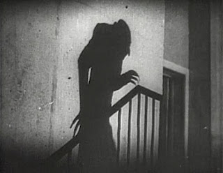
Nosferatu - a great pioneer in harsh shadowing and silhouette in cinematography - USEFUL!
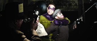
Cinematographer Larry Fong's work on the 2009 film 'Watchmen'
Conrad Hall's Cinematography on 'Road to Perdition'
Gordon Willis Cinematography -
Famous for use of Shadow and Underexposed film


_-_Google_Art_Project.jpg)

_-_Study_in_the_human_motion.jpg)


.jpg)


No comments:
Post a Comment